Happy fall, fabulous!
So at this point you’re probably transitioning into your fall marketing, which is awesome, because if you hit your fans’ social media, you’re going to notice they’re posting pumpkin spice lattes, mustard colored scarves against rust colored sweaters, and boots walking through the fallen fall leaves. It’s all red, yellow, orange, all.the.time.
It’s fall #bookstagram at its best.
Which means you need to keep up. Watching what fans post, helps to determine what they want to see from you.
Worry not, dear one, I’ve got you covered:
Take a day this weekend and collect a bunch of “fall stuff” to use in your bookstagram and marketing photos. Think leaves, pumpkins, scarves, etc. Use golds and bronze tones, browns, and deep fall reds, oranges and yellows. And then experiment.

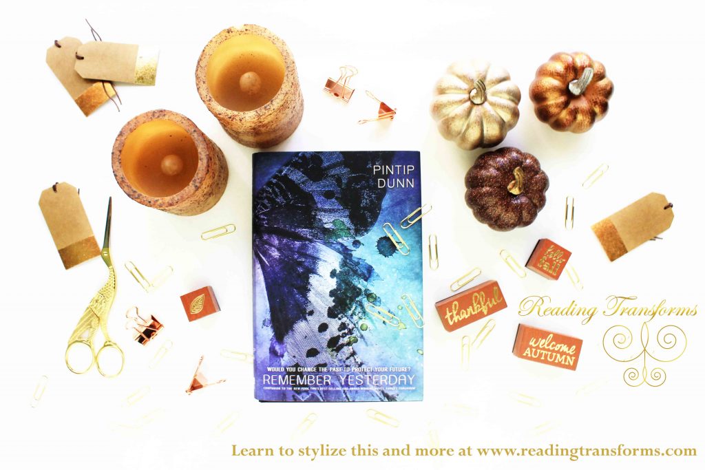
In this image I created a fall deskscape. I used gold and brown fall stamps, navy and gold tags, a pumpkin bowl to hold my clips, gold accents within the magnifying glass and scissors, and I added some pumpkins and a leaf. It’s effective because it’s functioning like a deskscape image which puts the book into the hands of the viewer because “it could be like their desk at home.”
Want to see exactly how I set this up? I Facebook Live broadcast this shoot and THEN took the photo. You can see it on the Young Adult Edition page.
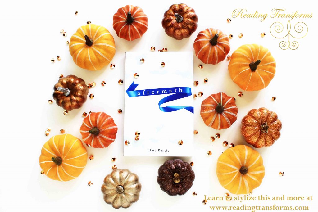
I mixed real look pumpkins with decorative pumpkins in glittery bronzes, olds and oranges. I then added some accent sparkles with bronze colored jewels to make the blue in the cover pop.
Again, I broadcast this live, so you can see step-by-step how I placed everything where I did.

In this image I used all three books in the series and set them in different heights to add visual interest. I paired it with a gold background (so the white cover didn’t drown against the white background) and added the brown toned candles (which bonus points, candles come up in the series in an important way) and then I added the metallic decorative pumpkins to offset the candles. I don’t like things too “match” so I tossed in a leaf (trust me, finding the right place for that baby wasn’t easy-you can see my struggle in the live broadcast version of it) and ta da.

The hair in the cover pretty much dictated this entire shot. I pulled in all the color tones of the hair in the pumpkins and the candles. Candles in one corner, pumpkins off to the other side without being matchy so that it catches the eye. As always, you can see the full thing in the live broadcast on Facebook.

I went with another deskscape for this, using the stamps, some gold jewels with accents of sparkly pumpkins and the leaf. Notice how some of the stamps and jewels overlap the cover, but never cover anything important up like the title or author name.

Purple is one of my favorite accent colors for fall colors, so I surrounded the book with deep reds and oranges. The leaves overlap the cover, but don’t cover anything important. I added some bronze jewels for a sparkly pop.
Another deskscape, obviously a favorite of mine, where this time I added in gold scissors, candles, gold paperclips, gift tags dipped in gold and bronze flecks, binder clips in bronze, stamps in brown and gold, and metallic pumpkins.

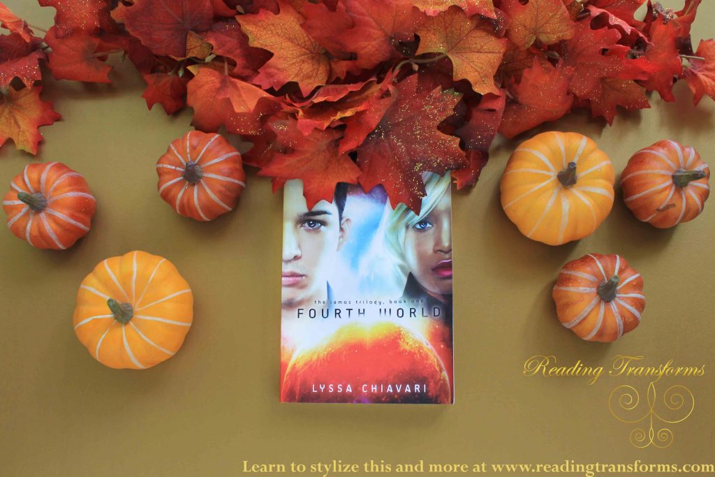
Leaves are actually very important in this book, especially falling leaves, so I put the grouping of leaves higher, almost as if a tree branch, and then added one single leaf as if it were falling. I added pumpkins in the top corner to offset the leaves and sprinkled some golden jewels to draw the eye in with leading lines (photographer word) to get people to look where I want them to-the cover.

Once again, I used all three books in the series, but set them at different angles (something the photographer in my loathes, but I did for this one image anyway) and offset the bright green, red, and blue with pumpkins. I used the bottom corner and the top middle for the accent pumpkins to make sure it would grab attention and still make the covers pop.
I used the gold background to make the colors pop in the cover. I kept the leaves up toward the top and accented with three pumpkins on either side that are similar but do not match in layout.
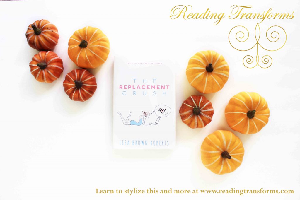
With a simple color, I wanted a simple layout. A few off center pumpkins in either corner draws the eye in directly to the book (again, that “leading lines” photography word) Simple and elegant.
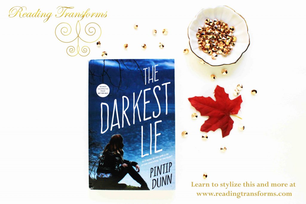
In this deskscape I used a trinket bowl with bronze jewels that I then sprinkled on the “table” and added a red leaf for just a subtle touch of fall.
All of these behind the scenes videos can be seen over on the Young Adult Edition Facebook page where I spent the entire day styling books LIVE for you to see. Catch everything over there.
Have questions? Drop me a comment or show me your work in the comments below.
Stay inspired,
-K.M.